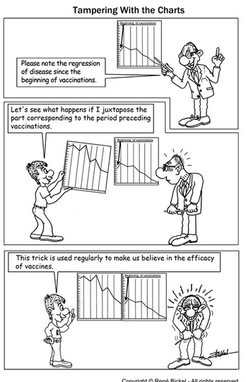
Graph propaganda
[back] medical mind control
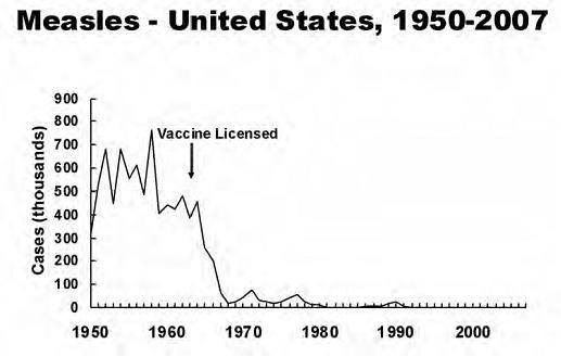
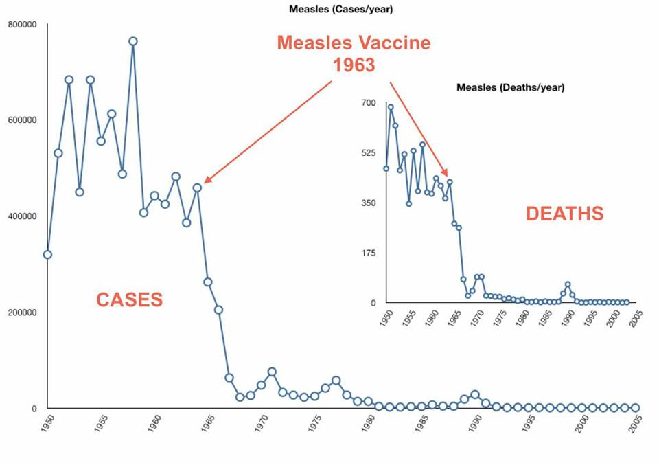
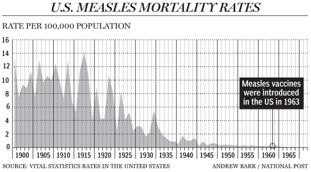
[The usual ploy is to use graphs that start not long before vaccination started, eg the one Michael Fumento used is a classic. You would never think measles deaths had declined by 99.4% before vaccination (from 1901/2. A common deception is to use only measles incidence as a smokescreen to hide death rate. Incidence is easy to fiddle, e.g. Measles diagnosis (hiding Measles)]
See: Graphs Measles deaths
"I was astonished and not a little perturbed to find that when you draw a graph of the death rate from whooping cough that starts in the mid nineteenth century, you can clearly see that at least 99 percent of the people who used to die of whooping cough in the nineteenth and early twentieth century had stopped dying before the vaccine against whooping cough was introduced, initially in the 1950s and universally in the 1960s." I also realized that the reason the Department of Health’s graphs made the vaccine appear so effective was because they didn’t start until the 1940s when most of the improvements in health had already occurred, and this was before even antibiotics were generally available. If you selected only deaths in under-15-year-olds, the drop was even more dramatic – by the time whooping cough vaccine was part of the universal immunization schedule in the early 1960s all the hard work had been done. [2015] THE DOCTOR WHO BEAT THE BRITISH GENERAL MEDICAL COUNCIL BY PROVING THAT VACCINES AREN’T NECESSARY TO ACHIEVE HEALTH Dr Jayne Donegan
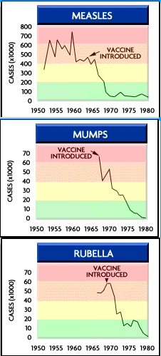
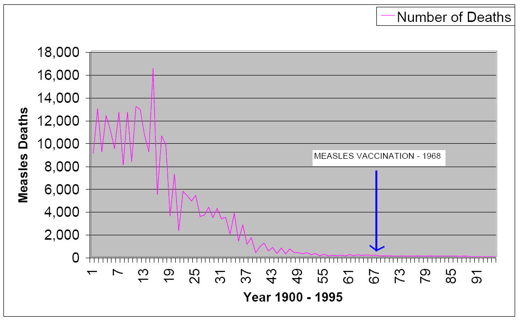
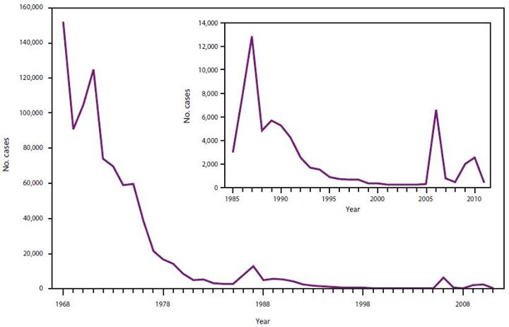
The deceptive graphs: